The Unbearable Sameness of the Modern Web
Today I went digging back in my portfolio and tried to pin down when I switched over to using UI frameworks, instead of rolling my own components. Misty-eyed, I rolled around the thought “there’s always a last time a parent picks up their child” but, you know, focusing on me and how I’ve given up on coding up my own UI components.
I think it happened around 2017-2018. It’s a pretty stark demarkation in my projects — from dense, angular, monochromatic UI to large amounts of padding, rounded corners, and peeks of color. It also looks… well, sloppy. Everything’s too spaced out, and you can clearly pick out which UI framework I’m using.
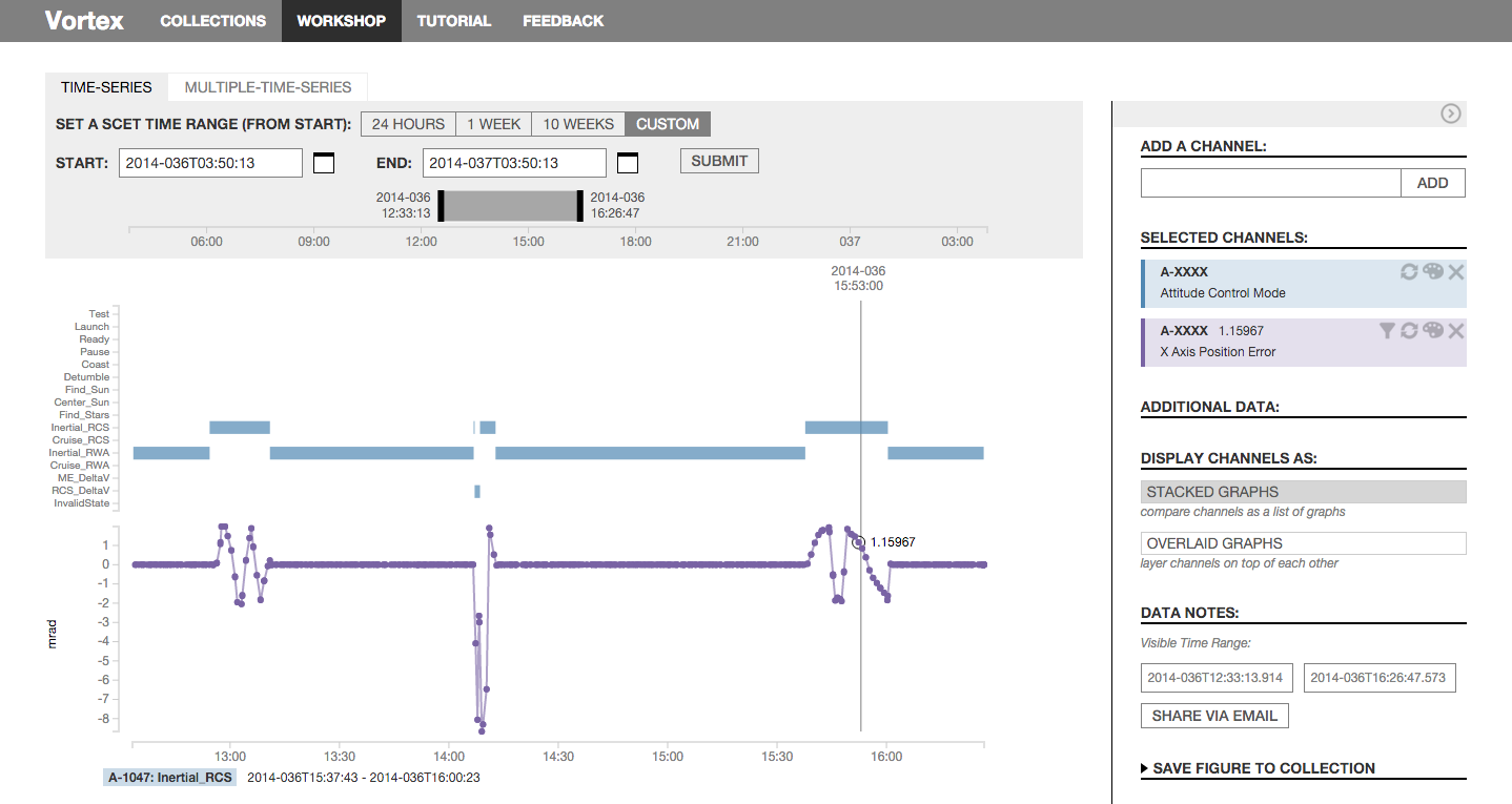
Ah, but think of the time savings of using a framework! Yes of course. When I was working at Netflix, I was building internal tools where the important thing was speed & insights, with visual design polish much further down on the priorities. Antd served me well for data-dense UIs, and I didn’t give it much thought.
Templatized website builders have proliferated on the web, which is mostly a really good thing! Everyone who wants their own website should be able to make one, even if it does look, well, squarespace-y. Any tech company worth their weight these days has their own design system, a nice little component library built on top of some master framework, with small tweaks for the specific business use case.
Also, it’s BORING. It’s BORING AS HELL. Guh, bring back interesting websites, bring back the creativity that the web offers. Bring back frontend devs who aren’t afraid to get down with the mouse event handlers!!
There is so much room for creative expression on the web! Standardizing UIs makes sense for large software companies — but please, let’s hold the line with the WWW also being a space for you and me to make weird little sites.
I was thinking to do blobs, but then I realized everyone’s doing blobs. So I decided to go as garish as possible.
sickos voice yes, YES!!